Brand Guidelines

Logo Usage & Restrictions
The preferred approach is to use the full color GreenPath logo. Our logo speaks to GreenPath’s mission of financial health for all. Below you can find examples of how to use our logo and icon on different backgrounds. Download all official versions (zip).


Spacing around the full logo should be at least the height of the smaller text in the logo. Elements such as text, rules, borders, illustrations, photographs (when not used as a background) and trim edges should not extend into this spacing.
- Minimum width of the logo should never be scaled smaller than 1.25”.
- Minimum width of the icon should never be scaled smaller than .5”.

- Do not flip or change the colors of the logo/icon.

- Do not stretch or condense.
Color Palette
Based on Web Content Accessibility Guidelines (WCAG 2.0), the criteria for level AA requires a contrast ratio of at least 4.5:1 for normal text and 3:1 for larger text, greater than 24px or 19px and bold. The web accessible combination chart provides approved brand color combinations that meet WCAG 2.0 level AA standards. This quick-reference chart shows which colors provide enough contrast to be used as text against a light background, and which colors don’t have enough contrast to be readable as text but could be used as a background.
Primary Palette
The primary palette may be used extensively both for headlines, body copy, large areas of color and as accent colors.
#102446 | Aa
100% Opacity
#4c5b74 | Aa
75% Opacity
#8791a2 | Aa
50% Opacity
#c3c8d0 | Aa
25% Opacity
#e6e8ec | Aa
10% Opacity
#87BD48 | Aa
100% Opacity
#a5cd76 | Aa
75% Opacity
#c3dea3 | Aa
50% Opacity
#e1eed1 | Aa
25% Opacity
#f3f8ec | Aa
10% Opacity
#ECECEC | Aa
100% Opacity
#f1f1f1| Aa
75% Opacity
#f5f5f5 | Aa
50% Opacity
#fafafa | Aa
25% Opacity
#fdfdfd | Aa
10% Opacity
#000000 | Aa
100% Opacity
#404040 | Aa
75% Opacity
#7f7f7f | Aa
50% Opacity
#bfbfbf | Aa
25% Opacity
#e5e5e5 | Aa
10% Opacity
Aa = approved ADA color contrast in conjunction to background color.
Secondary Palette
The secondary palette complements the primary palette, providing additional range to the brand experience. They work well as accent colors for borders or rules, and as backgrounds behind typography or graphics, but should never replace the primary palette as the main color(s) of a design. ** Secondary colors should never replace the primary palette as the main color(s) of a design. **
#EB7125 | Aa
100% Opacity
#f0945b | Aa
75% Opacity
#f5b791 | Aa
50% Opacity
#fadbc8 | Aa
25% Opacity
#fdf0e8 | Aa
10% Opacity
#572c5f | Aa
100% Opacity
#816187 | Aa
75% Opacity
#aa95ae | Aa
50% Opacity
#d5cad7 | Aa
25% Opacity
#eee9ef | Aa
10% Opacity
#1E575C | Aa
100% Opacity
#568185 | Aa
75% Opacity
#8eaaad | Aa
50% Opacity
#c6d5d6 | Aa
25% Opacity
#e8eeee | Aa
10% Opacity
#E8AF28 | Aa
100% Opacity
#eec35e | Aa
75% Opacity
#f3d793 | Aa
50% Opacity
#f9ebc9 | Aa
25% Opacity
#fdf7e9 | Aa
10% Opacity
Aa = approved ADA color contrast in conjunction to background color.
Alerts and Notifications
General Notifications
#572c5f | Aa
Success
#87BD48 | Aa
Error
#EB7125 | Aa
Typography
We’re using two fonts across our platforms: Roboto Condensed and Roboto. Because of its clean lines and crisp angles, it adheres to our ADA compliant standards from desktop to mobile.
We’ll incorporate custom modifications to these typefaces where an artful touch is needed.
ROBOTO CONDENSED
Roboto Condensed is an impactful typeface. Its condensed appearance serves well as headlines, and sub headlines. Regular 400, Regular 400 Italic, Bold 700, Bold 700 Italic.
- H1: 40px, bold
- H2: 35px, bold
- H3: 22px, bold
** If Roboto Condensed is not available, the alternative typeface is Arial Nova Cond.
ROBOTO
Roboto is our most versatile typeface, mostly used for body copy with special treatments: Regular 400, Regular 400 Italic, Bold 700, Bold 700 Italic.
- Body text: 14px, 400 regular
- Sub text: 12px, 400 regular
** If Roboto is not available, the alternative typeface is Arial.
FINANCIAL
WELLNESS
FOR EVERYONE
NFCC CERTIFIED EXPERTS
Visual
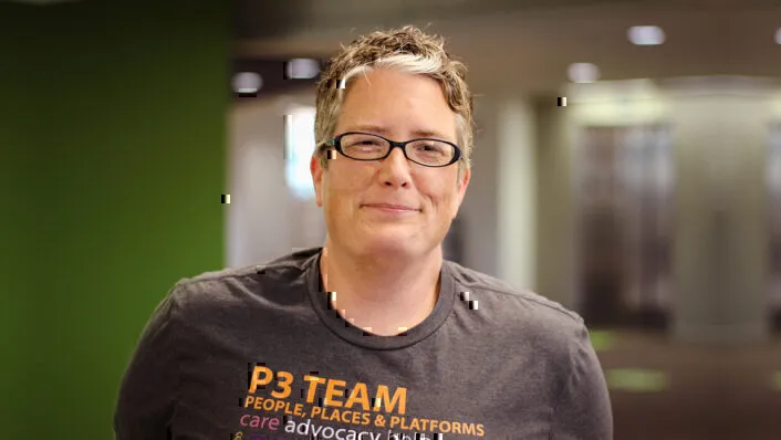
GreenPath teams with people throughout the nation to provide guidance, counseling and education that empowers financial wellness. GreenPath’s visuals reflect our more than 60-year mission as a caring, trusted and inclusive national nonprofit.
Our creative revolves around the people we serve. Diversity and a sense of realness keep the GreenPath brand consistent. Our goal is to clearly communicate the genuine value of GreenPath debt counseling services by putting people at the center.
Examples

Financial Counseling Services
GreenPath Financial Wellness is a trusted national nonprofit with more than 60-years of helping people build financial health and resiliency.

GreenPath Can Help You Pay Off Debt Faster
With the Debt Management Program from the national nonprofit GreenPath Financial Wellness, you become debt free faster

NFCC CERTIFIED EXPERTS
Our professional, compassionate team will treat you with respect and dignity. Talk to a counselor for support on your journey to financial wellness. 100% pressure-free. Call now for immediate help.
Primary Button
Secondary Button
Icon & Symbols
GreenPath utilizes Google’s Material Icons and Material Symbols.
The GreenPath Voice
Through a caring approach to financial counseling services, education, and employment practices, GreenPath leads with empathy and compassion to create a world in which all people have an equal opportunity to lead financially healthy lives.
We share real stories from those we serve to communicate the difference GreenPath has made in people’s lives. Our brand voice uses clear and concise language that is accessible and easy to understand, as well as inclusive and respectful of diversity.

EMPATHETIC
With the Debt Management Program from the national nonprofit GreenPath Financial Wellness, you become debt free faster

COMPASSIONATE
Whatever it is that you dream about doing in your life, and however your financial situation stacks up, our kind, professional counselors are ready to support you.


NONJUDGMENTAL
Regardless of your financial situation, our counselors are here to help. Reach out today. Our financial counselors can help find a solution that works best for you.
